Warm Neutral Color Palettes That Transform Your Home
Warm neutral color palettes can completely shift the mood of a home, making it feel inviting, calming, and effortlessly elegant. Unlike cooler neutrals, which can sometimes read sterile or flat, warm neutrals bring a soft glow and sense of comfort to every room. They’re also timeless, easy to mix, and work beautifully with most design styles—from modern and minimalist to rustic and traditional.
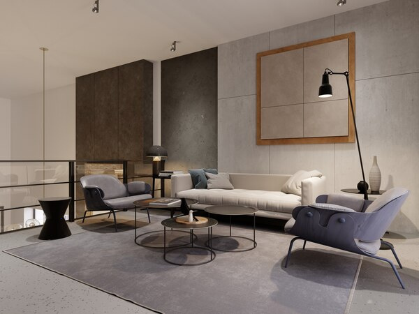
Below are key warm neutral palettes, how they work, and ways to use them so your home feels cohesive and thoughtfully designed.
1. Soft Beige and Cream: The Classic Cozy Foundation
A blend of beige and cream is one of the most versatile warm neutral palettes. It gives spaces a gentle, sunlit feel without overpowering them.
Core colors:
- Warm beige (think oatmeal or sand)
- Creamy off‑white (with a hint of yellow or peach)
- Light taupe (as an accent)
Where it works best:
- Living rooms and family rooms
- Bedrooms
- Open‑plan spaces
How to use it:
- Paint walls in soft beige or cream for a warm envelope.
- Choose a slightly deeper beige for sofas or rugs to ground the room.
- Add subtle contrast with taupe throw pillows, linen curtains, and wood accents.
- Keep finishes matte or eggshell for a soft, diffused look.
This palette is ideal if you want a calm, “barely there” backdrop that still feels cozy and lived‑in.
2. Greige and Warm White: Modern Yet Inviting
Greige—a mix of gray and beige—adds depth and sophistication while maintaining warmth. When combined with warm white, it feels modern and polished but not cold.
Core colors:
- Greige (with more beige than blue/green undertones)
- Warm white (think ivory or antique white)
- Soft mocha or café au lait brown
Where it works best:
- Modern apartments and townhouses
- Hallways and entryways
- Home offices and dining rooms
How to use it:
- Use warm white on ceilings and trim to brighten and visually lift the space.
- Paint main walls in greige for subtle contrast and a tailored look.
- Introduce mocha tones through chairs, picture frames, and textiles.
- Pair with sleek metals like brushed brass or warm black hardware for a contemporary edge.
If you love a clean aesthetic but don’t want a stark gray interior, this palette gives a stylish middle ground.
3. Caramel, Tan, and Camel: Elevated Natural Warmth
Caramel and camel tones bring to mind leather, sand, and sunlight. This palette is rich yet still neutral, creating a luxurious but unpretentious feel.
Core colors:
- Camel (warm tan with golden undertones)
- Caramel brown
- Light sand or wheat
Where it works best:
- Living rooms with leather furniture
- Libraries or reading corners
- Dining areas with wood furniture
How to use it:
- Anchor the room with a camel‑colored sofa or leather chairs.
- Keep walls lighter (sand or wheat) so the space doesn’t feel too heavy.
- Add texture through woven baskets, jute or sisal rugs, and linen or cotton textiles.
- Accent with black or deep bronze elements to keep the look grounded.
This palette is especially effective in rooms with good natural light, where the warm tones can really glow.
4. Warm Taupe and Mushroom: Subtle and Sophisticated
Warm taupe and mushroom tones are understated but incredibly chic. They create a sense of calm and are great for spaces where you want to relax or focus.
Core colors:
- Mushroom (a gray‑brown with warm undertones)
- Warm taupe
- Soft stone or putty
Where it works best:
- Bedrooms
- Bathrooms and powder rooms
- Home offices
How to use it:
- Use mushroom or taupe on the walls to add depth without darkness.
- Keep bedding, towels, and major textiles in stone or putty for a layered monochrome effect.
- Add warmth with wood nightstands, woven blinds, or a textured headboard.
- Introduce subtle pattern through herringbone, small checks, or tone‑on‑tone stripes.
The result is a restful, tailored environment that doesn’t rely on bold color to feel complete.
5. Terracotta Neutrals: Earthy and Expressive
Terracotta‑inspired neutrals are still warm but have more personality. Think clay, baked earth, and sun‑washed brick. When used softly, they can still function as neutrals while injecting character into your home.
Core colors:
- Soft terracotta (muted clay, not bright orange)
- Light cinnamon or rust beige
- Warm ivory
Where it works best:
- Kitchens and breakfast nooks
- Entryways
- Accent walls and smaller spaces
How to use it:
- Choose a desaturated terracotta for an accent wall or backsplash.
- Keep surrounding walls and large surfaces in warm ivory or cream to balance intensity.
- Layer natural materials like terracotta pots, clay vases, wooden cutting boards, and linen tablecloths.
- Combine with black metal or deep brown wood for contrast.
This palette suits homes aiming for a Mediterranean, bohemian, or earthy modern aesthetic.
6. Honey, Sand, and Light Wood: Airy and Sun‑Drenched
Honey tones paired with sand and pale wood give a breezy, relaxed atmosphere reminiscent of coastal or Scandinavian interiors—just with a bit more warmth.
Core colors:
- Honey (warm golden beige)
- Sand
- Light oak or ash wood tones
Where it works best:
- Kitchens and dining rooms
- Open‑plan living spaces
- Scandinavian or Japandi‑style interiors
How to use it:
- Opt for light wood flooring or furniture with a natural, matte finish.
- Keep walls in soft sand or off‑white to reflect light.
- Use honey tones in textiles—throw blankets, cushions, and bed linens.
- Incorporate plenty of natural light and avoid heavy, dark curtains.
This palette creates a calm, uplifting environment that feels fresh year‑round.
7. Warm Neutrals with Black Accents: High‑Contrast and Chic
Warm neutrals truly shine when paired with a small amount of deep contrast. Black or charcoal accents can keep a soft palette from feeling too gentle or washed out.
Core colors:
- Any warm neutral base (beige, greige, taupe, camel)
- Warm off‑white
- Black or very dark brown accents
Where it works best:
- Living rooms
- Dining rooms
- Minimalist or modern interiors
How to use it:
- Keep walls and large furniture in warm neutrals.
- Introduce black through light fixtures, frames, cabinet hardware, or a single accent chair.
- Use thin black lines—window frames, table legs, floor lamps—to add structure without overwhelming the space.
- Balance with textures like bouclé, linen, and wood to keep the room from feeling too sharp.
This is a powerful way to make a neutral home feel intentional and design‑forward.
8. Layering Textures to Deepen Warm Neutrals
Color is only half the story—texture is what keeps a warm neutral palette from looking flat.
Textiles:
- Linen, cotton, and wool add softness and natural variation.
- Bouclé, sherpa, and knits give extra coziness in living rooms and bedrooms.
Hard surfaces:
- Wood (especially oak, walnut, or pine with warm stains).
- Natural stone with warm veining (travertine, limestone).
- Rattan, cane, and wicker for visual interest.
Finishes:
- Matte or satin paint finishes enhance softness.
- Brushed or antique brass, bronze, and warm nickel keep the palette cohesive.
When colors are subtle, combining different textures is what makes a space feel rich and layered rather than plain.
9. Choosing the Right Warm Neutral for Your Space
Not every warm neutral will look the same in every home. Light and surroundings matter.
Consider:
- Natural light direction:
- North‑facing rooms tend to be cooler—choose warmer beiges, creams, or camel tones.
- South‑facing rooms get warm light—moderate it with greige, taupe, or mushroom.
- Existing finishes:
- Warm woods (oak, pine, cherry) pair best with warm creams, sand, and caramel.
- Cooler finishes (gray flooring, white marble) may need a greige or soft taupe to bridge the gap.
- Room purpose:
- Relaxing spaces like bedrooms and living rooms benefit from softer, lower‑contrast palettes.
- Social or functional spaces like kitchens and dining rooms can handle more contrast and structured accents.
Always test paint samples on multiple walls and view them at different times of day to see their true undertones.
10. Adding Color Without Losing the Neutral Feel
You can keep a warm neutral base and still enjoy color by choosing hues that complement the warmth.
Good companions:
- Dusty blush and muted terracotta
- Sage, olive, and eucalyptus green
- Soft denim or slate blue (sparingly, for contrast)
- Deep wine or aubergine accents in small doses
Use these in pillows, artwork, small furniture pieces, and decor items rather than large surfaces if you want the overall mood to remain neutral and serene.
Transforming your home with warm neutral color palettes is less about strict rules and more about balance: warmth without heaviness, texture without clutter, and contrast without harshness. By choosing the right combination of beiges, greiges, taupes, caramels, and complementary accents—and layering them thoughtfully—you can create a space that feels calm, welcoming, and timeless for years to come.